
“Datashine” is an impressive new online tool for looking at census data. It’s been developed by James Cheshire and Oliver O’Brien at University College London. If you are curious about our district it’s definitely worth a look (especially if you are a councillor!)
If you click here you go to a map centred on Rochford.
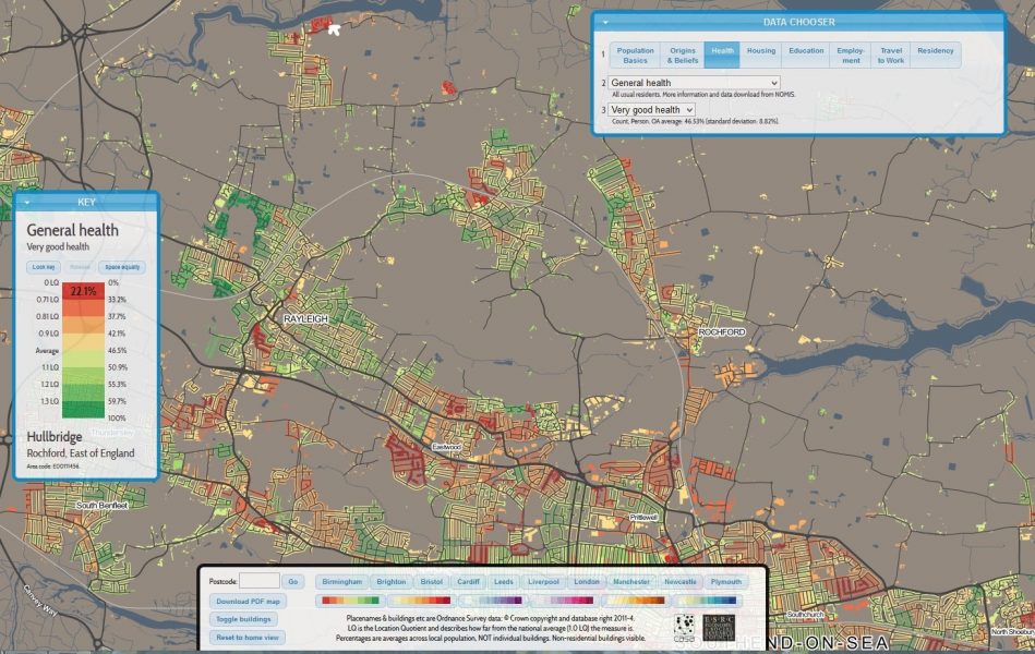
Then you can play around with the “Data Chooser” and select from a deluge of census data. For example, if you adjust the data chooser for 1 ) “Health” 2) “General Health” and 3 “Very Good Health” you get the following display, where the green roads have the highest number of healthiest people. As you move your cursor around , the key tells you what council ward you are in. So with the cursor at the top of the image you can see that only 22% of people on one of the caravan sites in Hullbridge said they were in very good health. (Click on the image to enlarge):
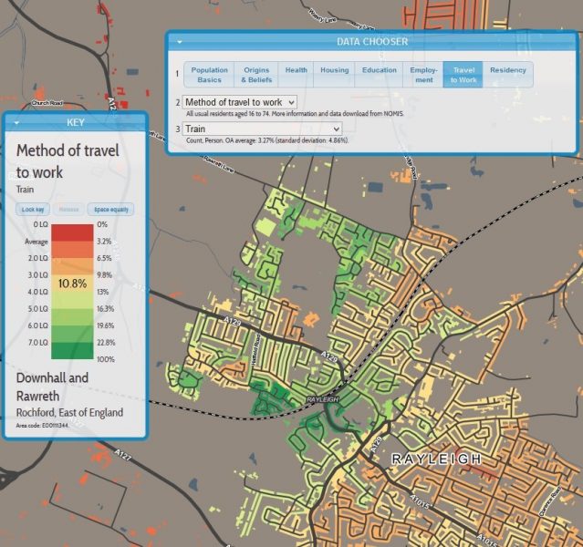
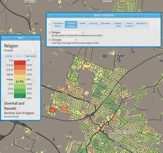
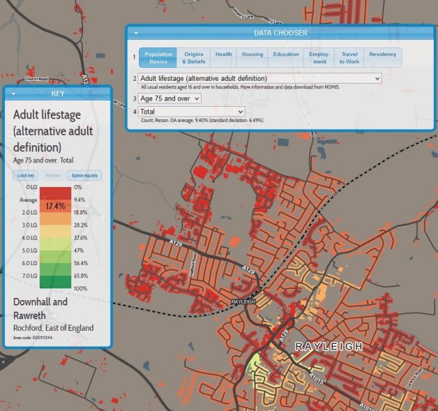
Here’s some more examples (in each case with the cursor pointing to Brixham Close in Rayleigh).
Percentage of families with dependent children:

Percentage of adults with a university degree:

Percentage of adults aged 17-74 who commute by train:
Percentage of people who are Christians:
Percentage of people aged 75 or over:
Hat-tip: The Guardian
